Jeffrey Veen

Raiders of the Lost Ark and the mystery of inspiration

At a conference recently, I heard Dan Cederholm from SimpleBits talk about inspiration. He showed a bunch of different techniques he uses, including howw he uses Photoshop's mosaic filter on an image to blow up giant pixels representing the basic colors in the picture. He uses those as pallets for the design work he does. Very cool.

Inspiration can come from process, but it can also come from the most unexpected places. For example, when we were designing the data-over-time visualizations for Google Analytics, we were totally stuck with bar graphs. We'd iterated dozens of times, scoured the web for examples to steal, and had tried just about everything. The result felt muddy and chartjunked; the data didn't feel clear and was weighing down the whole page. Finally, I told the team to forget about that problem for a while - we had some time, we could come back to them in a couple weeks. So we did.

Inspiration: Travel montage from Raiders of the Lost Ark

Inspiration: The lines-and-dots chart

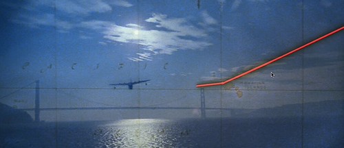
The next month, I got the box set of Indiana Jones movies and watched Raiders of The Lost Ark. I still love that movie. But that night I had a dream inspired by the travel montage - the one where Indy is flying to Nepal. The plane's route is traced as a line that bounces from city to city across a map, leaving a big dot where they landed. In my dream, I could see the airplane flying over our charts, trailing a line behind it, leaving a dot at each data point. The next morning I woke up, grabbed my laptop and drew a line-with-dots chart in OmniGraffle while still in bed. It's what we ended up using in the new version of Analytics (with a tremendous amount of polish from the team, of course).

Moral of the story: sleep with your laptop.


This entry was written by Jeffrey Veen and posted 12 July 2007 at 9:45 AM. It was filed under Web Design.

Comments
1. On 12 July 2007 at 10:05 AM Scott Johnston wrote:

I used to sleep with my laptop, but now I sleep with my iPhone. I feel like I'm cheating on my Macbook.

2. On 12 July 2007 at 10:06 AM Ryan Sholin wrote:

"Moral of the story: sleep with your laptop."

No.

Moral of the story: Watch 'Raiders of the Lost Ark' more often.

3. On 12 July 2007 at 2:55 PM Geof Harries wrote:

Sleeping with your laptop AND watching Raiders of the Lost Ark? What, are you single or something? :)

4. On 12 July 2007 at 8:53 PM Alex wrote:

Um... most of the time I'm sleeping with my PowerBook, and my wife is sleeping with her MacBook, all in the same room... is that some kind of unholy foursome?

5. On 12 July 2007 at 8:58 PM Alex wrote:

(I should add though, I do agree with your meaning here - it's good to have your tools handy for when inspiration strikes; much like a muso with their paper and pencil - or *their* MacBook these days. And even with something on the surface as simple as a chart, the design element can still bring that need for the creative *zing* to fire for the creator to be truly satisfied with it.)

6. On 16 July 2007 at 12:25 PM John wrote:

Am I missing something .... Why did it take so long to come up with an X-Y scatterplot ?

7. On 19 July 2007 at 8:28 AM Joshua Porter wrote:

I would have sworn this feature was an offshoot of Tufte's sparklines...funny how the right design kind of emerges...from disparate sources.

8. On 27 July 2007 at 5:55 PM Kenneth Colwell wrote:

Thank you for designing/developing a great way to show this data to people who have no idea what I'm talking about.

Even if the data is pointing out a problem, people still enjoy looking.

It's an incredible elegant solution.

thanks!

9. On 6 August 2007 at 12:39 PM james wrote:

I'm going to go out on a limb here and respectfully say I dislike the new graphing interface. I love the Raiders movies but it's not transferring into a useful chart for me. First, there are no intraday charts... how can functionality be removed like that? Seeing intraday traffic spikes is hugely important. Also my graphs end up being stretched across the screen and which exacerbates the problem of the graph always having about 50% more Y data points then unnecessary so the graph ends up being overly flat. I used the old interface until it was phased out. I can't be the only user reporting these problems.

10. On 8 September 2007 at 5:26 PM uxdesign.com wrote:

Keeping a notebook, digital or analog, is an old habit of all productive geniuses... listening to the quiet inner voice is not enough, we must take notes!

Humbling to know our unconscious mind is often wiser than our conscious one, I think.

:)
http://uxdesign.com

11. On 12 September 2007 at 9:30 PM John Armitage wrote:

Hi Jeff,

The self-drawing route map may have first been used in the first minutes of the 1942 film Casablanca.

I've had graphic dreams also, yet they are mostly gibberish and, unfortunately, often nightmares.

12. On 24 September 2007 at 12:13 AM Tinus wrote:

Hello Jeff,

The graphs look great. However, I still can't get used to the fact that your labels are positioned *below* the lines in the graph. It confuses me, especially when a dot is located at the same position as the label. I really feel the labels should be positioned next to the line.

Tinus

Currently:

() More...

About Me

Bio: Jeffrey Veen
Book: "The Art & Science of Web Design"
Book: "HotWired Style: Principles For Building Smart Web Sites"
Work: My LinkedIn Profile
Travel: China, Tuscany, Kayaking in Baja, Touring Costa Rica, Studying Theater in London

Popular Posts

» Making a Better Open Source CMS
» Seven Steps to Better Presentations
» A Contrast in Urban Design
» IA Jargon Watch
» On Writing Short
» Pain and Cycling

Recent Photos


XML Feeds

This XML Button links to a feed you can subscribe to. Subscribe to my site
Click the link above to be notified automatically every time I add a new post.

Creative Commons License