Chartjunk
In his book, “Envisioning Information,” design guru Edward Tufte explains how visual design can skew and manipulate seemingly objective data. In particular, Tufte rails against something he terms “chartjunk” – the clutter and confusion that plague most charts. He’s talking about the hash-marks, labels, garish colors, and other extraneous bits that make their way into information design in the name of clarity. Tufte’s writing has always been influential on my work, especially considering how import clear visual communication is to Web interfaces.
So here’s a great example of chartjunk. As I’m becoming more familiar with Jaguar, I find more and more interesting applications. One of which, the CPU Monitor, offers a view of the recent history of the performance of certain subsystems. The problem with this display is apparent the instant you open it. Thick black lines cross the chart to indicate both the amount of processing happening, as well as the duration of each sample. The effect is a headache-inducing swarm of little white dots buzzing before your eyes.
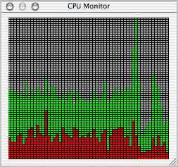
Apply some of Tufte’s techniques and look at the result. I took out the vertical hash-marks, since the process level bars sufficiently designated units of time on their own, then toned dow the horizontal marks to 20 percent grey (though they probably don’t need to be there, since the only useful information is the relative amount of processing, not the exact amount). The green and red indicators in the original don’t represent “go” and “stop” or have any cultural significance, so I toned them down as well, choosing complimentary pastels to simply show the difference. (They represent “system” vs. “user” processes, by the way.)
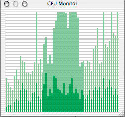
And don’t go thinking this is just decoration – a “prettier” version of the original. The whole point of good information design goes well beyond the mere aesthetic. A good design should facilitate understanding (which I don’t really think I’ve improved all that much here) as well as reduce the effort required to use that knowledge (which I was able to fix). If you were using charts like this all day to do your job, I’d be willing to wager you’d feel a lot less fatigue come quitting time with the later example.