Charles Joseph Minard's visual stories
You may not be familiar with the name Charles Joseph Minard, but it’s likely you’ve seen his work. He served as a civil engineer in 19th century France and developed an interest in cartography later in life. In particular, he was intrigued with showing variable data on maps – how quantities of shipped goods moved along waterways, for example, and later troop movements in military maneuvers.
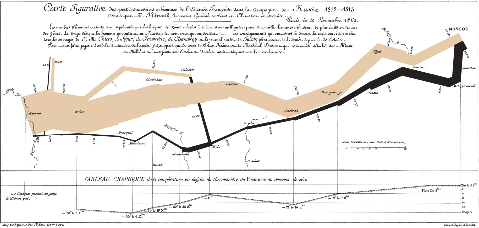
Minard started drawing in his mid 60s and didn’t create his most famous work until he was 80 years old. In it, he shows the progression of Napoleon and his army to Moscow and back in the campaign of 1812. This chart was renown as a masterpiece of economy and insight, and imortalized in Edward Tufte’s “The Visual Display of Quantitative Information” – a virtual bible for information design since its publication 26 years ago. Tufte even sells the chart in poster form from his web site, making it a staple in designers’ cubes at nearly every creative office I’ve ever visited.
So I was researching Minard a bit more deeply for a presentation I’ve been giving and came across the following quote. In it, he talks about his “carte figuratives” – a phrase referring to his particular style of data visualization mixed with geography:
The aim of my carte figurative is … to convey promptly to the eye the relation not given quickly by numbers requiring mental calculation."
I really like how this idea of making something visually apparent while reducing intellectual work – a sort of cognitive ergonomics. Minard was suggesting that stories and meaning can be found in any collection of data. It’s up to us to uncover those stories and tell them clearly and accurately.
It’s a strong lesson for much of the work we do today. Much like the patterns in data visualization, designers seek out stories and meaning when crafting interfaces. Well designed sites “convey promptly to the eye” what’s possible, while doing so intuitively as to avoid “requiring mental calculation.” That’s not to say we should treat people as stupid. Rather, we should help them focus on what they’re trying to do, rather than struggle with the means for achieving it.
Or, another way, don’t make me think.