What I've been working on: The New Google Analytics
It's been well over a year since Google bought Measure Map and I left Adaptive Path. And wow, have we been busy. The problem is, though, that whenever someone would ask me what we've been up to, all I could do is smile and say, "Oh, just wait."
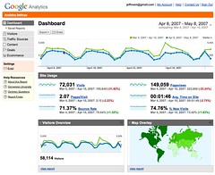
Well, the waiting is finally over - we can talk about what we've been working on all this time. Today, a completely redesigned version of Google Analytics is launching, bringing a lot of the simplicity and data visualization techniques we learned building Measure Map to a whole new scale. This was some of the toughest design work I've ever tackled, and I'm immensely impressed with well our team worked together, especially Greg Veen, Ryan Carver, and Douglas Vander Molen.
I wrote more about the redesign over on the Google Blog, and my colleague Avinash Kaushik has written a fantastic and comprehensive overview on his blog.
On a personal note, I've got a much different job now that the design work on Analytics has wrapped up. I now lead a team of over 30 designers and researchers responsible for the user experience of Google's web applications. We're working on Gmail, Calendar, the Office-like tools, Blogger, Orkut, Picasa, Talk and a bunch more. And that means I get to dig into some of what I consider the Web's most interesting challenges and work with some of the smartest people in the industry.
Can't ask for much more than that, really.
This entry was written by Jeffrey Veen and posted 8 May 2007 at 1:24 PM. It was filed under Personal, Web Design. | View blog reactions
MUCH!! MUCH!!! Better. Thank you for taking one for the team :)
Now, have they turned you guys loose on Urchin 6 yet?
Looks sweet. Can't wait to try it out!
Wow. So totally jealous of your gig man. Congrats -- and can't wait to start playing with Analytics again. So, does this mean the end of Measure Map?
This is the most amazing upgrade to any web application ever. Great job, you have made all our lives easier.
Question: Why did you go with homebrewed Flash as the mapping technology instead of Google Maps API?
Yow, that's lovely. Great work, all around.
Thanks Jeff, this an excellent improvement.
@Rob: Actually, the Flash maps we're using are based on the Google Maps API, we're just re-rendering them to be able to get the kind of data visualziation and interaction we were after. It's nice to be able to focus people's attention at each level - continent, country, state, etc. - as well as do custom onHover displays.
Congrats, Jeff, it looks great! We're bouncing screenshots around like crazy. Fantastic job.
Rock on Veen. Too bad my old school account isn't updated with the new look yet. These screenshots I'm seeing are much improved, ..especially in the LANGUAGE of the navigation. I always disliked how the previous version tried to classify views as "marketer" "executive" etc.. Those classifications got in the way of the data. These improvements are a big leap.
I like how the demo shows reports for the Adaptive Path site ;-)
I can't wait for the new UI to hit my Analytics account!!
What an eye catcher! I cannot wait to start get used to the new design. And the new features, of course.
YES...just what we've been waiting for! Great work.
Nice work, Jeff! Fantastic stuff.
Excellent work to all involved. I've used Google Analytics for several clients, but it was always hard for them to figure out what the metrics really represented. Admittedly I did too. This looks like a huge improvement. I can't wait for it to get rolled out.
This is pretty good news. I'll definitely have to check it out. Just like Chris Messina though, what does this mean for Measure Map? Is it dead? Is it now under GA, what's the status on MM?
It's impossible to keep up with you guys! Well done though, I had a look at the video on the site and some of the stuff just looks mind blowing.
Sill how long before you can tell me what they thought ;)
Google is really employing designers for a change. OMG. They will be unstoppable ;)
Great first look.
Keep it up!
Looks great Jeff.
I've been playing with it for the last hour or two... shiny buttons... graphs... wooohooo.
In response to Flash instead of raw Google Map feel. I didn't even know the Google Maps API was that flexible.
That's great tech but what's even better is that you took a design first attitude towards this application and it was totally worth the wait. Great job.
I think that we have to assume that Measure Map has been "Dodgeballed" so to speak. I, for one, still use Measure Map every day, but it sure doesn't look like we're going to be seeing any further improvements to it. Although from the look of things above, it might not matter anymore.
Congrats! really important the employ of designers for the change of Google.
Your work inspires a new generation of designers.Fantastic!.
Brilliant news, it really needed some new features - perfect timing as I was looking for a new analytics system so I can't wait to check it all out.
Jeff, that last paragraph is just awesome! Good to hear you're leading the redesign of Google's web applications user experience.
Yeah, to echo Chris, what is the current state of Measure Map? Is all of the blog analytical functionality that was in Measure Map in Google Analytics?
If Google is still pursuing Measure Map, do you risk losing all of the excitement behind Measure Map by having it closed to new accounts for so long? Will it just fade away into the sunset? Wouldn't it be better to be more transparent about what the plans are for it?
Thank god there is someone who's going to work with the google calendar team - check out the comments in its google group and frustration people have over a lack of user support [read sync feature].
Another item that's probably needs a bit more google love is the fantastic (yet outdated) 'hello' application!
Thank goodness! The new stuff looks awesome!
Awesome. Great work guys. On to bigger and better things!
Amazing work, Jeff! I'm very impressed. Like @justin thorp, I'd like your comments on what will happen to measuremap?
Jeff, the new version of Google Analytics looks fantastic. Can't wait to dig around when my account is switched over. But more impressive news is your new role - a design and UI overhaul for Google is well overdue! Congratulations.
(Maybe I won't have to run Jon Hicks' GReader skin in future...)
“Analytics has been successfully installed and data is being gathered now.”
The word data is plural, so the above sentence should be changed to read:“Analytics has been successfully installed and data are being gathered now.”
/M
As an American company Google uses American English. Details of how American English treats the word "data" can be seen at the Merriam-Webster web site:
Looks great. I can't wait to see what happens with the Gmail and co. ^__^
From Merriam-Webster's definition of data:
“The plural construction is more common in print...”I'm not sure what Google's style guide recommends. I think it's fitting to apply print conventions to the web, because the web is just the latest step in the evolution of the printed word. Seen in this way, the web is a direct descendant of books, newspapers, and journals.
If one follows the convention for printed word, the plural form is typically considered more correct.
Also, I always got the impression that Google's web sites were desgined by and for folks with a background in academia. These folks — researchers, educators, and scientists — are likely to appreciate such attention to detail; while others probably won't mind either way.
From the previews I have seen it looks great. I have an old account that hasn't merged the new design yet. I love what I have seen though - thanks for taking the time to make this application better.
Great leap forward!
Very nice UI with an easy to understand context.
Keeping all the numbers together like this, and with the sparklines!Overlay looks great and the e-mail function will be gold.
/Per
Simply a God-send! Finally analytics that are easy to understand, intuitively interactive and meaningful. I was locked into exploring and playing with the stats for over an hour the first day I saw it available in my account. It's made analyzing our traffic and advertising human-usable. I loved seeing your work at Adaptive Path, but my whole team is very happy that you're now tackling all of Google's applications as our business lives and breathes by them.
OMG -- Have you been gone for a year? I thought you were off getting a burrito.
This is better. Congrats. For Real.
What are the chances that this new team you're leading will address accessibility issues? Google doesn't have a very good track record of taking accessibility very seriously.
If accessibility is on the table, please just hire Joe Clark so I don't have to read him whining about every little thing you miss. =-)
How are Google's statistics any more accurate or meaningful than Analog's? Specifically, how do you determine a "user visit"? Answer: You can't.
Reference:
How the web works, section 4, paragraph 2:
"You can't tell how many visitors you've had."
http://www.analog.cx/docs/webworks.html
Your hands must be itching to start the redesign of Google Mail! It is in desperate need of a new fresh interface. Nice to hear that Google is finally realizing that a nicely designed interface is not just eye candy but an absolute necessity.
extremely well done. I am very impressed what you've done with Analytics.
Hey Jeff!
I love the redesign of Google Analytics. My only problem with it is that it has not affected my account yet. :-(
Thanks for taking the time redesigning this! You just saved me $20-$50 searching for another analytics tool. It's not much, but its better in my pocket than in someone else's!
PS
Regarding Orkut, is Google going to get serious about it? Orkut has the potential to rival Facebook, but its almost like they are taking their "wee little time" with Orkut and all.
I have noticed (and blogged) about many users creating hacks to improve Orkut life online, although I am not sure if Google is paying any attention to these useful hacks.
you are a UI god. The improvement is not only huge, but i'd say you just scared the crap out of every other stats provider. Excellent work.
This rocks. Can't wait to see what you've got in store for Orkut =]
I can't tell you how ecstatic I am about this. The first thing I did was call my clients to tell them to look at their new stats!
I love the new map where I can zoom in on a specific region. And the PDF output is a godsend and will help me in justifying so many things to clients and partners!
Quite simply put, fabulous UI, very intuitive, printed pdf reports look stellar, if you're not using Google analytics yet, you should be.
Wow, the new version is fantastic. Much better, well done.
I've been playing with this for a few days and just wanted to say (like everyone else) what a fantastic job you guys did - love the sparklines, the 'compare to past' tool is fantastic (especially the timeline), it just feels great. Now what we need is an API :D
I can see most of you have not had the wonderful experience of actually working w this tool yet.. I am sorry as I know this is not what the team wants to hear and will sound harsh but harsh it is because the new interface is simply a mess... I am sure you meant well, but you must not have received input from those who actually use the tool despite your claims to the contrary.. just a few items i have noted along with others who use it for in-depth analytics
I am sure you will probably take this with a grain of salt and you probably should but I am not the only one who feels this way and won't take long before millions of others do when they are forced to use this product... I am already searching out alternatives..Here are just a few of the issues and bugs
1. Buggy in Firefox
2. Graphics are ridiculously large
3. Text is too large
3. Data that used to be viewable on the front page are now 3-5 levels deep
ex. New maps - I used to be able to look at the executive summary and see where people came from and numbers right there. Now I have to do region/country/city before I can see anything - this is huge esp when monitoring activity on 500k visitors a month
4. Cannot see all goal data at the same time
5. Used to be easy to read now it is too white so it is all a disorganized jumble
6. Not organized well - things do not follow a logical progression
7. Items are difficult to locate
8. No real navigational elements
9. Can only view 100 items at a time instead of 500 not bad on small sites, but on a large site where we get 1/2 a million visitors a month it is severely restrictive
10. Cannot cross-reference on network location.
11. Cannot compare visitors, page views and conversion rates at the same time
12. Exports do not work in FF
13. No hrly reports
14. Cannot easily locate data that used to be in the tier one or two level
etc etc... I could go on and on but you can read the link at the top to see where just some of the issues lie..
And these were found within the first 30 mins of using it….
check it out for yourself and say what you think, but my guess is if you use analytics for more than checking the site traffic on your blog or small business site you are thinking oh cool look and feel but I know that if you are a heavy or corporate user of analytics you are probably reconsidering your options... give me old google - at least the data was easy to locate and cross reference.. not anymore ..I have always been very pro-google, but this and the recent irrelevancy of search results are starting to turn me off...asap
@post-it:
Thanks for your feedback. In response to your trouble with bugginess, would you mind taking a moment to send us specific bug reports? There is a contact link on every report in the application. The more detail you can provide, the better - what browser version and platform, the report you were looking at, any settings you'd modified (filters, views, etc.), and what exactly you were doing when you noticed the bug.
FWIW, we built the entire interface using validating, standards-based markup and style using cross-platform Firefox and Safari on the Mac. We then went back and ensured that all interactions and renderings worked in IE 5 and 6 (a particular hell I'd never wish on anyone). After that, we subjected the interface to weeks of QA testing that revealed hundreds of bugs, all of which we were able to remove before this final release.
Speaking of weeks of testing, we also ran dozens of usability sessions with both existing users and those new to the product. Both recall and discovery of reports was measurably improved across the board. Additionally, we got loads of feedback from early alpha testers, most of whom came from large organizations with highly trafficked web properties. We knew we'd be able to simplify the user experience, but we wanted to absolutely ensure we didn't obfuscate any of the powerful features our savvy existing users relied on. Not everything we heard from them was positive, but when it wasn't, we fixed the problems.
I agree with you about the hourly reports. That's a feature that didn't make it into the new release. We're working on it.
Thanks again for your feedback.
Jeff, as an avid user of the google apps you described I am looking forward to your design improvements on these products. I must admit that i had stopped using Google analytics simply because the interface used to frustrate me so. What use was the power and functionality if it was so difficult to make sense of the data. Anyway I am a re convert and am about to get my clients onto analytics.
Great work!
Edmund Pelgen
Re: Google Analytics.
All I can say is: oh my god, change it back, change it back, change it back right now. The data presentation is useless and the structure has absolutely no logic behind it. It's meant to be pretty and it isn't even that. The old system is infinitely superior.
I know you guys beat your brains out over this new design. Unfortunately, you're the victims of "Version 2 Over-engineering" syndrome and you've blown it. Please change back the interface. If you can't do that, then at least leave the old interface up indefinitely until you get version 3 figured out, which I'm sure will be fantastic.
I've just recently logged in to retrieve a report on one of our heavy traffic websites - I think some of the people complaining need to be more specific, I suspect it's just a case of resistance to change.
Regardless, I'd like to introduce them to the Add To Dashboard button, if they don't like the structure :)
The new UI is fantastic - I am finding it a lot easier to relate metrics to each other. I cannot believe someone complained about larger font size on important numbers. Do you want the numbers in footnotes somewhere, then? :)
Data Views is a really useful little feature, and navigational analysis is presented in a much more useful manner.
But what really blew me away was the new Timeline for selecting date ranges. I didn't know I wanted it till I saw first used it. Makes it a heck of a lot easier to select "interesting" date ranges if you can see the troughs and peaks.
Great job.
However, I'm not sure if this is on your todo list, but I'll submit a request anyway - I'd love to move some other sites over too, but we have a fair number of historical logs.
Is there any plan to support logfile imports?
I know that a substantial amount of data that UTM is able to probe will be missing, and the ideas of a "session" will be lost due to nothing more than an IP address being available to identify a request. But I am willing to have a section of my numbers be less precise and accurate than the data that arrived via UTM, if these numbers were flagged as being "less trustworthy", just for the sake of having all my statistics in one place.
Hello - this is to Jeff Veen in response to your post - First let me preface with the fact that I honestly do appreciate you taking the time to request a response and to outline your efforts. And while this is going to sound harsh it is not meant to be personal. However, I find the new UI to be a completely inefficient and tedious and think it is best to tell you directly then to have you find out round about because you have only a limited release right now and on the groups pages there is little praise as is - when it goes to full scale my guess is there will be a lot of unhappy people out there when they realize basic functionality is missing and locating data is now a chore.
In addition, while I so do appreciate that it is a arduous process to create a new UI as I am a UI Designer myself - you violated one of the key constructs in UI development. NEVER radically change your UI and second only for one type of user. I am sure you are aware of that, but just as a reminder...
BTW i am not trying to be contentious but I find this part of your post a bit offensive "savvy existing users relied on". I am guessing you did not mean it this way, but it as if to say I am not one?
My company has 55k kw's with Google CPC based kw's that generate a lot of money for you. I am by no means a novice, but a person with 10 years experience who won a webby award for setting standards on the internet. I have listed the issues to your bug system and here, but will simplify and list again..
- Not cross browser compatible. Much of your functionality crashes Firefox outright. As for Opera, windows freeze and at times the site is non-functional.
- Missing data - I am not sure who your "savy users" were, but what webmaster does not need hrly reports, complete tabular data exportation (instead of row by row), country data viewable on screen 1 and cross references on network location. These are just a few of the regular complaints I read today before posting here and despite the fact that these are simple everyday uses for webmasters these are items that have been / according to your company - not added in at this time.
- Oversized irrelevant graphics - I do not need that calendar graph taking up half my screen. I need it when I need it. I don't when I don't. It is obtrusive and tediuos to have to scroll all over my screen to get to data because of the graphic and text size. (screen is set to a high resolution) A lot of this information is available in AdWords where it should be as the person managing AdWords needs it, the person managing site stats needs it much less. Please give us a way to hide the map.
I need other things there that were present in old reports like instant comparable data on all my goals in easy to read tables that include visits, pageviews, conversions, bounce rates at the same time - not items that represent these items that I have to click down to locate and even then have issues comparing easily. (conversions are not listed with visits and pageviews - columns do not contain totals) And the largeness of the graphics makes it very difficult to read. Eyes scan for patterns - the size of your text and graphics make that impossible and it becomes very tedious..
- Violation of the simplify clicks rule of UI development - instead of most daily data being in the top tier or top two I know need to 1) Figure out where it would be 2) click 3-5 levels deep to see what I could before with a flip of a screen
Perfect example is the map feature. Before I could look at the executive summary and see who was visiting from what countries and in what numbers by one glance, now I have to click through a map of the world - to a map of the region (which by the way means I need to know what region a country is in) - to a map of the country - to the maps of the city when before this was all available on page one. I have used this feature to help track suspicious visits from countries with limited access and now cannot even view that directly because they are not in the same region. From 1 step to 4.. and this is common.
The point is while you may have had many end users test it and you may have run usability testing my guess is you ran it with people who are not webmasters, who are not internet savvy as you say but laypople or department heads who were impressed to be in google testing - it just could not be the people who do what I do .. and the posts in google groups says the same thing.. The people who love it always preface with - well I don't normally use it.. and the people who don't preface with "why can't i?" and "where is that []?" and "how could that be missing?"
And if that is the case make this for the person who does not need highly sophisticated information in a quick and easy manner..and leave us with the old interface to choose from.. because when my CEO asks me for data it should not take me ten mins to find it and then another 10 to build dashboards.. while there are functionality improvements the UI is not easy, clean or user friendly.
IE I may think it is awesome to have a car that does 0-100 in 2 secs, I will not find it so awesome that there is key to get in the door, no speedometer to tell me my speed, no gauge to tell me my fluid level and nowhere obvious to start the ignition.. as someone said I think you fell victim to V2 overkill..
I am sorry and I am sure you will probably take rightful offense to my comments as I am sure I would if I had worked as hard as you, but for me your product is non-functional and trying to teach people in my company how to use it will be a nightmare.I have always touted Google and even convinced my company to use analytics in the first place which was no easy task on our site (implementation of js code on all our pages), but I did. If these issues are not fixed, then I will do what I can to convince my company to go to another product. While it my not be free, it will not undergo radical shifts geared to the people who want big shiny graphics and little substance.
And again I am sorry - I have no doubt you worked hard on this project and maybe there were other hands in it that created these situations, but it is what it is and to say anything else would be nonconstructive. And of course take what I say with a grain of salt, but know I pulled all my information from posts on the internet today and not just from my experience.
And please resize the graphics! If I am stuck with it, then at least make it so I can make those incredibly childlike in size graphics small enough to glance at and add summaries to your columns and exports for all tabular data..
Just to respond quickly to Mr. Breedt -
"I've just recently logged in to retrieve a report on one of our heavy traffic websites - I think some of the people complaining need to be more specific, I suspect it's just a case of resistance to change."
- It is unfortunate that you have decided real issues with functionality and cross-browser compatibility are just resistance to change issues. That could not be further from the truth. I was excited about the new product and happy to hear it was coming because I always find google to be very innovative, but this was innovation that sacrificed of usability and simple data access and that is not resistance to change - that is expression of a valid need to be addressed in some manner.
Regardless, I'd like to introduce them to the Add To Dashboard button, if they don't like the structure :)
-- I don't have time to spend creating dashboards - as UI Developer - Project Manager - SEO consultant - Web Designer - Copywriter etc. IE I work for a large scale company that has a minimal staff. We are much bigger than you would think hearing that, but not adding to our staff, so I simply don't have a few days to sit around and make up dashboards for what I used to be able to view on first glance. If you do, then that is fantastic and I am sure you will enjoy them, but I don't and so find this feature fairly useless. Good site architecture should never be supplanted by perceived functionality.The new UI is fantastic - I am finding it a lot easier to relate metrics to each other. I cannot believe someone complained about larger font size on important numbers. Do you want the numbers in footnotes somewhere, then? :)
-- Yes I complained. My eyes like most people's scan for data .. that is why a word can be missing half its letters and the brain still knows what it means.. but make those font sizes to big and I cannot quickly glance and interpret meaning. I have to scan back and forth across the screen and up and down the scroll. This is also basic Neilsen UI.I apologize if my tone sounds negative, but I believe it is very condescending to say points that are valid to me are not because they are not to you. My points are valid and not just to me but many others as will be seen as the posts in groups get more and more negative. I have not seen one post from a person who self-describes themselves a webmaster, that is happy with the product, while some are more tolerant of its issues - no one is saying yay! this is great! at least not those people who actually use it for site management, security surveillance, and content management. If you only need surface stats, I am sure it is great for you.. for the rest of us it is missing key data in easy to get to places and that is a very real issue.
Thank you -
Cool!
I like the new UI a lot, but at the moment I am still using the old one because despite Google's claim that "the new interface has everything the previous interface had", the ability to cross-segment by network location has been removed.
Can the next item be added to the wishlist?
I would like to be able to make the difference between the source of each session of the visitor and the source of the first session through which the visitor entered the website.
What do I mean? If you have a website with a lot of repeat visitors and repeat conversions within 30 days, I would like to know the source of each session. With Google Analytics each conversion in repetitive sessions is still contributed to the source of the first session (as far the cookie hasn't expired).
I do not like the new interface at all. It has become much harder to track the data I need. I run a e-commerce site.
1) The way you select time periods is a lot harder to do. I can't select a year, or view daily traffic (hourly) anymore. I used to be able to do either of those with a single click.
2) The large traffic graph is really annoying when I try to select a small time period it's still displaying a month's worth of data.
3) Finding the ROI was really hard, once I found it there's no way to see Cost and ROI on the same table.
4) I can only view 100 keywords now, instead of 500.
I honestly do not believe you when you say you tried to not take away from your user experience.. The data is harder to find and harder to read. Sorry, but this version is a flop as of now.
-Matt
Correction on #3, you can't see Cost and Revenue on the same table.
My analytics accounts were finally updated and I tip my hat to Jeff and team. I always found the old analytics unfriendly, especially navigating through the reports; who came up with those navigation labels. The new navigation scheme is simple and logical, if I want to know about my visitors I look under visitors. You definitely captured my mental model. Kudos!
Why has the cross segment of Network Location been removed?
This is a very important feature for us. We run various marketing campaigns that are tied to specific URLs on our website and
of course we want to see who is visiting these URLs due to the campaign.This is a very important metric and I am really disappointed this is not in the new version, especially as Google said that functionality wouldn't change, only the UI.
Please re-instate it!
I'm looking forward to getting to know the new interface better, but right now I'm still using the old interface: the new interface crashed by browser twice. Crash me once, shame on you, crash me twice, shame on me -- so I'm not using it until I hear that's been fixed.
My partner also had the new Analytics crash his browser -- his computer has no commonalities with mine, we use totally different software, purchased our computers from different sources, and configured them separately, so I can't tell you exactly what his setup was. I do know he's running some version of Firefox, and Windows XP. I'm running Firefox 1.5 and Windows XP.
We both had our browsers crash when we were trying to change the date range. It wasn't consistent, I was able to change the date range succesfully a few times before it crashed.
A quick trip to the Google Analytics forums showed that there are a number of reports from Firefox users having the new Analytics interface crash when they try to change the date range. It looks like most of the others are getting a Flash error, but for me, Firefox just completely crashed with no error.
Beyond that, with the little time I've poked at the new system, the first thing I did was search high and low for the hourly data -- which again, is a hot topic in the Google Analytics forums. It's a bit frustrating to be told that none of the functionality is missing, and then find that the thing you use most is *poof!*... gone. I'm so glad to hear it's being worked on -- but is it being worked on seriously, or passively? Is it going to be fixed before the old interface is removed?
Other than those two things, there are things I like and things I don't like about the new interface, but I can't really suss out exactly how I feel until I understand the interface better... there's a good chance that the things I don't like can be remedied by my learning to use the new interface, but that can't happen until I can actually use it. Where is the best place to keep an eye out for news that the Firefox/Data Range crash problem has been identified/resolved?
Maybe I'm missing something, but the old Analytics accounts and their corresponding Website Profiles are missing. No data, no accounts. I successfully added a new account, but my previous ones are gone.
I was tracking:
oswego.edu (gone)
ask.binghamton.edu (gone) and successfully added
binghamton.edu todayAny ideas on what happened to my profiles/data?
To Matt the one who posted about ecommerce - I am betting that it is people like us with ecommerce sites (and the ones most in need of the analytics for monetary decisions) are the ones who are really finding this site deficient- all the "wow its so cool and shiny" people are not trying to view visits, bounce, page view and conversion rates all on the same table (which you cannot get to anymore), or bulk export 10's of thousands of lines of information in a report, or who need to use network location for cross reference or who need hrly reports to make informed decisions, or who need to see country data instantly not 5 clicks down, or who need keyword and landing page data cross referenced or who are going to create so many dashboards that they will spend all day scrolling because the architecture is so poorly designed for us.. nope shiny happy bloggers, small site owners and the rest are going to determine the nightmare for the rest of us.. I physically get an ill feeling in my stomach every time i try to just locate the simplest of datum.. nope seems that google decided the webmaster/ecommerce director was unimportant..
so cheers to all of you who find the lack of comprehensive data so appealing - I love to hunt and peck for everything and then screen shoting it so i can review it together.. or even better making another oversized graphic for my home page that is still not comprehensive for my needs..
for me it just means more work and that makes me angry -- and as an angry customer whose company spends more than a million a year in ad buy from Google....you think it would matter but it doesn't from what i have read here.. so yay for the user who does not really need it -- so glad it impresses you with it shiny oversized graphics, browser issues and lack of proper functionality for people who actually spend money on google ... the 12th graders here need a product that is not geared to the kindergarten class.. but thanks to Google we are now writing on wide ruled construction paper with colored crayon - yay i am so happy about it I could just scream....
I have a really nasty problem with the new interface, there is no way to select a date range. I get a flash error: "This script is causing Adobe Flash Player 9 to run slowly...".
I tried this on multiple browsers (FF 2.0, IE 6.0, Opera 9.2) on Windows XP x64, on a single machine and I get the same error message. I also tried to install Flash Player 8 but I still get the same error.
It would be nice to check the ActionScript behind the date selection tool and try to solve the problem. At this point even if the new interface is absolutely great, the tool is almost useless with this problem.
Thank you!
I would like to second the comment around Cross-Segment by Network Location. That functionality appears to have been removed or lost, and it's really going to hit us because we built some reporting/visibility functionality into our trading partner enablement processes based on the Analytics functionality around tracking user behaviour.
Any chance of baking that functionality back in? If not, why not? Also, can we keep the old UI up for existing users who rely on that functionality?
Thanks - otherwise there's great stuff in the new UI.
Peter
For whatever reason, perhaps out of habit, I was not completely sold on the new design at first. After using it for about a week now I'm amazed at the level, and depth of thought that has been put into the flow of the application, and the look and feel. Absolutely cutting edge and best of breed in every way. Congratulations on all of your hard work!
Jeff:
Want to give feedback on the new analytic product. For me, the old version graphing is superior but I can see why you’ve done what you’ve done.
Problems:
1. Can’t plot visits + pageviews on one graph - critical.
2. Can’t plot visits/pageviews grouped by month… where has this gone?!? I want to look at a year and see monthly values plotted… this seems to have been nuked. CRITICAL! Every other product does this :-(
3. Graphs are so “squat” that small variations aren’t visible.. can we please be able to see them in a different format/full-screen? Since when were graphs displayed in ultra-ultra-widescreen ratio?
4. Hangs IE when the flash widget is rotating fairly often.
Thanks, hope these get corrected before the old (better) graphs are removed.
Overall it was a great job! It is almost a masterpiece!
For some reason it keeps on crashing on me whenever I try to change the date range in both IE & FF.
I see that a few others have this problem:
http://groups.google.com/group/analytics-help-troubleshoot/browse_thread/thread/2e0636f8e5436839This is the only bug I noticed, but it's a big one.
I hope you can fix it soon.
Thanks and keep up the great work!
I think that this list of posts tells a good story.
Most of the early posts were praise from people who had a quick look and were seduced by the new sexy dashboard interface. After a few days posts appeared from people who were trying it out and finding bugs (which will presumably be fixed) and more importantly functionality that is missing in the new version.
I've been a software developer for 27 years and one thing I've learnt is that when you enhance a product people don't expect to lose functionality that they have been relying on to run their business.
The new interface may be brilliant but its the functionality that matters. If the old interface disappears the thing I will miss most is the Geo Map Overlay showing the positions of visitors.
When all is said and done Analytics is free so Google can do what they like with it.
JEFF - Is Google intending to make the old interface available permanently?
Mike Sanderson,
Malvern Hills,
England
Yes Mike I agree-
I get a bit frustrated with all the posts that say - oh how wonderful this is - but you know it does crash my browser and the reports aren't there, but OH GENIUS! I am sorry but lack of key metrics that have always been present, a product that crashes a browser every time you try to select a date, an ecommerce product that does not give hourly reports or bulk export of data is not a superior product and truthfully i find the UI very difficult to read - bar graphs that should be vertical, no column totals, inability to see conversion data with other key metrics... this is not genius - this is adding lots of snihy stuff in the hopes that no one notices the 1000 and 1 issues it has - Now I do believe if you are a blogger (for who this product was actually designed) or a Fortune 100 who does not rely in this for your key analytics you will say "WOW COOL! Shiny Stuff! AWESOME!" but for those of us who need just the basic information an ecommerce tracking tool should offer (Because if you are paying for adwords en masse you need this tool to make educated business decisions, not to see how many visits your blog page had) and did offer before this change then you are pretty much out of luck and I think that is very unfortunate.I have always been a big supporter of Google and its products. Even headed the effort to add it to our site, but this is a huge disappointment and it will be interesting to see how many kool-aid drinkers exist after a few weeks...(NOTE many of these people who post the WOW Oh so Shiny posts found on the net either work for Google or a company that trains people on Google - shame on Google for spamming the internet) Because when you are unable to look at your hourly reports to see if you should change 1k keywords or you cannot bulk export your data for some VP in your company or you cannot tell them the keywords for a landing page or screenshot the conversion rate on a keyword along with visits, pageviews and bounce rates as in the old software I do not think you will be singing its praises - and don't even get me started on the oh so cool it lights up when i roll over it map that used to display city data on the first page, but now requires 5 levels to get to..
oh and please don't respond with the dashboard scenario - maybe if the graphics were not in the "Look at my kindergarten page" range then they would be somewhat useful, but since architecture and metrics were sacrificed with the idea that this tool would be the selling point to all that find it impossible to locate their information.. try again -- i have to add so many items to cover what the old one did that it makes the page unbearable esp given one graphics takes up about 250 to 300 pixels down.. does anyone there actually use a screen resolution the general public does or are all of you on 27 inch monitors with 1260+ res??
I know I probably sound like a luddite resistant to change and if it makes you feel better then think that, but trust me I am not. I was very excited about this product and very disgusted that the user who actually spends money with google was a secondary or even tertiary driving force.. so yay! bloggers get something simple to track visits to their site and stroke their egos while the rest of us are stuck with a far inferior product.
one final note.. this is not a free product for a lot of us, but a necessary one for those of us with serious kw buys. When my company spends well into the 7 figures with a company the little analytics tool that comes with it is not free, but a tool to help guide us in that spend.. trust me we pay plenty... at 50k kw's this tool has never been free...
but that is ok .. my company has decided that since you do not look like you will be fixing these issues anytime in the near future we will happily pay someone else.. and in the end the new product is one some of us always wanted and so keep on going for the blogger and the noncommerce user - of course that is good for the blogger and noncommerce user because it means there will be no one with money to sell to because those who needed it for the real metrics will be gone and you will be left with the people who only use you because you are free..and they won't ever pay, so there will be no way to sell it..
ie -- if i have a car that goes 0 - 100 in 2 secs i am not going to be very happy if in order to do that they removed the ignition and placed it under he seat and made me sit on the right side to reach the left.
there may be some nice new data in there, but at the expense of some very needed metrics and usability.. anyone who reads analytics everyday must find the oversized graphics, the calendar chart that never goes away, lack of information detail and the upside down graphs to be as annoying as I do.. I just am not going to drive the car from the right seat in order to have a 6 dvd stereo .. there is useful then there is unnecessary but cool to have.. seems google went with the latter.. too bad those of us who spend real money need the former..
Most of my problems have already been mentioned but I think it's important to register these individually to demonstrate interest.
1. I miss having the date picker on the front page. I used to be able to select dates and ranges with one click, now it needs three (and takes far longer to reload).
2. Where has hour by hour data gone? I need this to analyse my Adwords campaigns and decide upon scheduling. I can't imagine why this has been dumped, surely it's important to measure variations over a day?
3. Where can I find the network segment? When I get 'direct' hits I like to know the referring domain; so far I've been unable to find this info in the new version - if it is there is buried far below the useful level it was in the old version.
4. The data seems far more dated than with the old version - maybe 1 - 2 hours older. This may be a beta issue.
5. Why, when I select a range, are all the graphs still showing a two month period? If I chose a specific day or range I want to see only the graph for that period, not info I've specifically excluded.
6. Like many other posters here, I don't find the 'fluffy bunny' look appealing. I use Analytics for business, not fun, and functionality is WAY up there beyond the colours and the font. It's slow and looks like a 5 year old's toy laptop, sorry.
There are *some* improvements. I like the ability to zoom the geo map - being in the UK this was always pretty useless in the old version - but then again, this is largely a visual toy rather than an important element so it's improvement doesn't rate highly with me.
I like that some key elements are now presented on a single page and the ability to build your own personal page could be useful.
However overall I really, honestly, can't see any improvement over the old version. It seems to have been changed merely for looks rather than function and I AM trying hard not to simply be resistant to change. I use Analytics all the time and I've really tried to use the new version but going back to the old one is actually a relief.
I can't see how any 'upgrade' can *lose* functions and be presented as an improvement.
Jon
For ME, it's better. I want to get in, see how we're doing at a glance, where the traffic's coming from, and how the funelling is going.
For us, the new interface is much much better, a drastic improvement. I can see that there might be issues for other people, but personally, I find it so much more useful and intuitive that I'm just happy it's here.
The interface is cool but i liked the old map view better with dots where the people came from and also the exports arent as precise as the other one what i mean is we dont cant have the country and city we have the choice of country OR city wich in my view is not that good. and also u cant export all, ur restricted to th length of 100.
Terrible. I actually teach about and professionally use Analytics. Google is of course free to do as it pleases with a "free" product but this "refresh" just looks childish and removes functionality previously present. How is this an improvement? I can't even get the map to display on my computer. I used to be able to track (and export) data for visitors from across my province (BC). Gone.
No this is a poor move in my opinion. I'll presume that all the "nice" posts are from insiders patting one another on the back rather than from true end-users of GA.
Too bad.
Yes Peter I think you are right - if you read the forums on sites were people use analytics for business uses you see very few rave reviews... most are frustrated that unnecessary bells and whistles replaced very needed metrics..
besides they are just too positive .. I mean the original posts sounded like google just made the second coming happen .. (and i saw quite a few repeated all over the net like an RSS feed) I mean who really gets that excited over a product that spits out statistics ..sure a little excitement of course, but every post on the beginning of this blog is ecstatic to the point unbelievability.. and no one mentioned actually using it .. just my observation.. and I concur with the rest of yours as well ..
and as someone said earlier this product is not free if you spend money on adwords or adsense.. then it is just a tool that let's you spend your money better..
I am glad to see that Google is willing to take such an approach. Congrats. It has been a tremendous step forward for Google. Many people now will really have an insight into what web analytics is all about. Though it's also crucial to keep an eye on the features (simplicity in design is excellent, but power users defenitely have a demand for cutting-edge features). Keep up the good work and it would great to exchange ideas on future development resp. provide feedback.
I'd kinda agree on the eye candy front, the new look is definitely softer and more appealing, but this seems to have been to the detriment of some core functions. One in particular is really aggravating:
I used to be able to use the Dynamic Content report to get a full CSV dump of all the entries into our online submission field. This allowed me to analyze over 20,000 entries all at once.
Now dynamic content is included under content drilldown, and exporting the data limits me to 100 entires at a time (limited tot eh rows displayed on the page). Very frustrating.
This was an essential tool for our business, and now it's gone. There's no mention of why, or even an acknowledgment that the function has been removed.
urgghhh
it has been removed along with hrly reports, cross reference by network location, pageview/page visit comparisons, yr long data retrieval, kw cross references (forget which ones) the list goes on and on... thank goodness we will be changing to a paid package -- of course we have no option at this point.. seems bloggers are what determined the structure of this product (measure maps was a bloggers product) commerce people were left out of the loop..
can someone tell me why the actual number of conversions was removed from the conversion report. Percentage is nice, but somewhat useless if I have no idea what the actual number of conversions is.. .
In the new interface when I click the
date to select a particular date range, I get this error:***
A script in this movie is causing Adobe Flash Player 9 to run slowly.
***Same thing happens on IE and same on Firefox at home. But this doesn't happen at work.
Jeffery. Awsome! This tool is extremely easy to navigate. Our Ecommerce Director is impressed as well. I have personally integrated analytics into five of the sites I deal with. I am am interested in seeing how you will expand the offering. The ability to track dynamic site pages would be extremely useful to our company. We have to deal with session variables and store instances.
Jeff. I use this tool daily at my day job and the improvements are so nice. Usability, readability, and the design in general is so much better, cleaner, and more intuitive. I love the new PDF report generator... I think it's new, well if it wasn't it's certainly easier to find now. The PDF reports really do look nice as well. Well done sirs at Google.
I can't believe this product is free. You guys rock!
I was really looking forward to the new Google Analytics... until I tried to use it. The first thing it did was crash FireFox when I went to use the date dropdown. It's still kind of a crapshoot everytime I click on it. Does the same thing in Safari, though not quite as often. Can't really speak for IE, since I'm on a Mac.
Hourly reports are also lacking. As these are a feature I use quite frequently, I've had to resort to going back to the old version.
Also, you can't veiw a graph of a small date range. It's always for the entire month. All you can do is change the highlighted portion. What good is that? Big graphs like that don't show near enough detail over short ranges, especially if you need them for presentations and the like.
It would also be nice if everything weren't so ridiculously big (both graphics and text) but that's an aesthetic issue, not a functionality itssue.
I have to say that I love the new interface...when I can access it. For a week now I've been getting intermittent errors that have nothing to do with the Flash errors that seem to be a known thing. If I try to access the dashboard for anything, I get:
"An Error Has Been Detected Please try again.
If you are experiencing long delays, please reduce the selected date range or disable date comparison. Thank you for your patience."Flash is up to date on my PC, I'm not running Firefox and I'm not using a Linux environment. It's like there is some connection not being made between the new web interface and the infrastructure and data meant to populate it.
I just fired off a reply to the first email I sent to customer service asking about the problem, but their initial response leads me to believe that word hasn't gotten around to them that this problem is out there in spite of it's being reported in discussion groups.
I'll have to go back to the old interface until it's fixed.
Two things:
1) I tend to look at a single day view (today) to see how things are going based on new posts of my blog. The visitor and pageview counts do not match from the old interface to the new beta interface when I select today from the calendar on the visitor report(UnlikelySalsero.com). I'm assuming the new interface is behind the old interface by a few hours?
2) I really miss the hour by hour view available in the old interface that is the default if I select a single day. I have to go back to the old interface to find that view and it's one I use regularly. I'm hoping I'm missing something in the new interface.
Hopefully they will keep the old interface available until the hourly visitor/pageview report is working in the new version.
Cross-segment by Network Location. Use it. Need it. Lost it.
Makes Analytics New Interface
I notice that I see a delay in the Beta analytics that lags a few hours behind the original interface (which tends to lag behind real time by a couple hours). Is this going to go away, or will the original interface tend to always be a little ahead of the beta?
Also, I'd like to throw in my hope that you're able to bring back hourly reporting sooner vs. later.
Thanks for keeping up the work on this, analytics is a really great product.
Hi everyone! You can cross reference with Network location. Here's how to do it:
click on network location. Find the network you want to cross-reference and click on it. There's a nice little "segment" dropdown there. Cross-reference to your hearts desire!
First, i want to congratulate you on the new design.
however, I have a serious problem here and it seems that many others are facing it (our firefox latest version 2.0.0.3 with the latest version of Flash player 9 crashes when trying to change dates on Dashboard)
this is really serious from the user (us) point of view
I hope you confirm/deny that.
Thanks
sorry going to a network and crossing is not the same as taking a kw and crossing it on all networks - as far as i know that feature was there and now is not.. i don't want to cross on a specific network i want to cross an item on all networks associated -- it is a big difference... and the one people are complaining about..
Please reinstate the ability to cross segment top pages by network location. We need it back!
Hi. Yes, interesting surrender all are described. I recently read
about this article in on the other resource. There plenty of are
written about tramadol online .
LOW PRICE!!! Free Piils package for all reorders!!!
I quite like the new Analytics but have two concerns:
1. The Map Overlay "city" detail level is in fact not as detailed as before - previously, you could view a "sub-city" level (eg I could see Suburbs within Sydney Australia, now they are all binned up into just Sydney).
2. It's unfortunate that the Map Export doesn't export the latitude & longitude. This was useful for those of us who then use the lat/long data to plot in Google Earth or elsewhere. If that data is collected, why not make it available to us?
Thanks
Geoff
IT seems that in the new version everywhere the notion "average" has disappeared. I want it back: for comparing things "average per day" is very useful.
in addition to everything else that is missing .... please put back conversion data with the visits. page view etc data.. at least the overall conversion numbers.. i wanted to get the conversion per traffic source but when i go from the first screen to the second i get two different sets of referring sources.. ugh what a mess...
if want to see how many of the visits from site xxx converted .. esp because we have partnerships with those companies... but now there is no easy way to do that
Please reinstate the ability cross reference content, keywords, campaigns, etc by network location - it is such a critical element of our AdWords spending decisions. Other missing elements I would like to see returned include life time value, domains, and the ability to export more than 100 items at a time. Thank you.
I was wondering who did the new UI because it is remarkably simple and intuitive despite the complexity of all the different reports.
Overall, there is a lot to like about the new look and feel of GA.
My main complaints are:
1) No traffic by hour - I used to use this report quite a bit and it doesn't seem to be available in the new interface2) Exporting all rows of data to a csv file. Currently, in the new interface you can only export the number of fields that you are viewing (10, 25, 50, 100).
I like the new look.
Lots of pretty graphs and all of that shiny stuff.
I am missing some things though.1) Exporting all the dynamic content, contained within a section of my website, to a csv. Now, the exports are limited, while previously I could get a full report.
2) Dynamic page content overview. I'd like to see all the visitors to a specific page, regardless of the parameters entered.
This was in 'content optimalisation=>dynamic content'.
No clue as to where it is now...
I love the updates to analytics - however there are a couple of things I would like to see changed/ improved. I have written about them on my site - 5 Google Analytics things I would change
unimpressed.
data is missing (i NEED to be able to cross-segment by network location, why take this away?!?!?) or is now several clicks deep.
the graphics are too large and obtrusive; looks like a comic or a children's book.
really really unimpressed.
please also return visits and overall conversion data with the pageview table.. I did a search for a page and all i got back was pageviews uniq pageviews bounce etc.. this is all completely useless if I don't have visits and conversion rates.. what do I care if the page was viewed 1k times if 10 people viewed it and no one converted.. these metrics should never have been split apart.. yes i know the goal conversion tab is supposed to be the replacement, but it is not.. i cannot see all the data from page one on page two and so I have to remember the numbers or export two items.. a big waste of time.. there should be an overall conversion rate and there are times when you don't even get those options and all you get is the pageview table.. please fix this issue...
Hi Jeff,
Could you please return some features on the new Analytics? The geographical location is not as accurate (Astoria = Brooklyn = New York now, and that kinda sucks). Also, the hourly data was extremely useful. I find myself spending more time on the older layout than on the newer, it's a shame.
Thanks in advance
Vicnent
Vincent,
I can't return the features to Analytics, but the team of developers working on the application can. They've been busy since the redesign solving some technical and design issues. I just posted about the latest version here:
http://www.veen.com/jeff/archives/000968.html
Thanks everyone for all the great comments on the redesign. This post is drawing a huge swarm of spammers, so I'm going to close off comments here now...
Currently:
() More...
About Me
Bio: Jeffrey Veen
Book: "The Art & Science of Web Design"
Book: "HotWired Style: Principles For Building Smart Web Sites"
Work: My LinkedIn Profile
Travel: China, Tuscany, Kayaking in Baja, Touring Costa Rica, Studying Theater in London
Categories
» Business (6)
» Cycling (27)
» Information Architecture (15)
» Personal (80)
» Software (14)
» Technology (90)
» Travel (38)
» Web Design (96)
Popular Posts
» Making a Better Open Source CMS
» Seven Steps to Better Presentations
» A Contrast in Urban Design
» IA Jargon Watch
» On Writing Short
» Pain and Cycling
Recent Photos
XML Feeds
Subscribe to my site
Click the link above to be notified automatically every time I add a new post.

