Designing Google Reader's trends
 I’ve been on vacation for a few weeks, but I had a nice surprise waiting for me when I got home: the first example of our design work at Google has publicly launched.
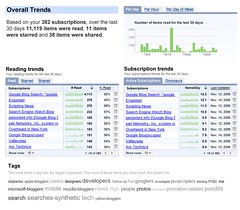
Last month, we spent some time working with the Google Reader team on an new feature they’d been developing. As a hosted application, they’ve got lots of data about what people are reading and how often blogs get updated. Wouldn’t it be interesting, they suggested, if you could visualize your reading behavior and see how it matched up with publisher’s behavior. Since we have some experience with data visualization, we jumped at the chance to do a 20% project.
The result is a set of charts and graphs that attempt to help people not only understand how they interact with content, but let them act on it as well. Turns out this is a great interface for pruning away feeds that you’ve either lost interest in or are no longer being updated.
But beyond the visualization, this serves as a good example of collecting and understanding the ambient information that flows through our digital lives. I’ve been fascinated by this for a while, but started thinking about it more last year when Tom Coates posted on the topic. As we move through our connected days, the thousands of tiny behaviors can be recorded and analyzed, helping us to better understand who we really are, be it through the music we listen to, the sites we bookmark, or the money we spend.
It makes me want more! Places I go, people I meet, energy usage, calorie consumption, heart rate – just imagine all the streams of data we can record and review and learn from. But for now, I’ll settle for the feeds I read.
For more on the feature, see Mihai’s post on the Reader blog. If you have a Reader account, you can view your trends here. If not, have a look at this screenshot.