Be Less Specific
Take the stairs in a building with a basement, and you’ll likely notice a gate in the stairwell when you reach the ground floor. This is called a “forcing function” – a physical impediment to jolt users out of their routine and ensure appropriate behavior. In this case, the relatively infrequent annoyance of opening the gate is offset by keeping panicked people out of the basement when the building is on fire. An extreme example, sure, but there are lessons to be learned for interface in digital products. Often, we can and should constrain user behavior to not just help them avoid errors, but make errors impossible.
Take, for example, the preferences interface in my online email reader. I’ve been given the chance to show an arbitrary number of messages on each page. Since it’s Web based, I find it tedious to page through the email listings, so I requested 200 messages per page. Here’s what the system told me:
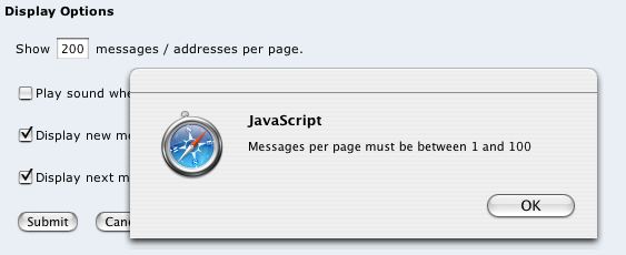
If the system can’t accept anything greater than a value of 100, then why am I able to type a number bigger than that? But more to the point, why do I have to type a number in the first place? Is it really that important to be able to specify that I want 83 messages per screen to be displayed?
A better choice would have been a drop-down menu with the options “10, 20, 50, 100.” I neither want nor need any finer grained control over this option. A drop-down would constrain my options in a way that eliminates the need for an error condition.
As a UI designer, I would argue that even if a small percentage of my users _did want more control, I should probably ignore them. And that’s just another way of saying that superfluous power may sometimes have to submit to overall simplicity.